Game Art Blog

Game Art Blog
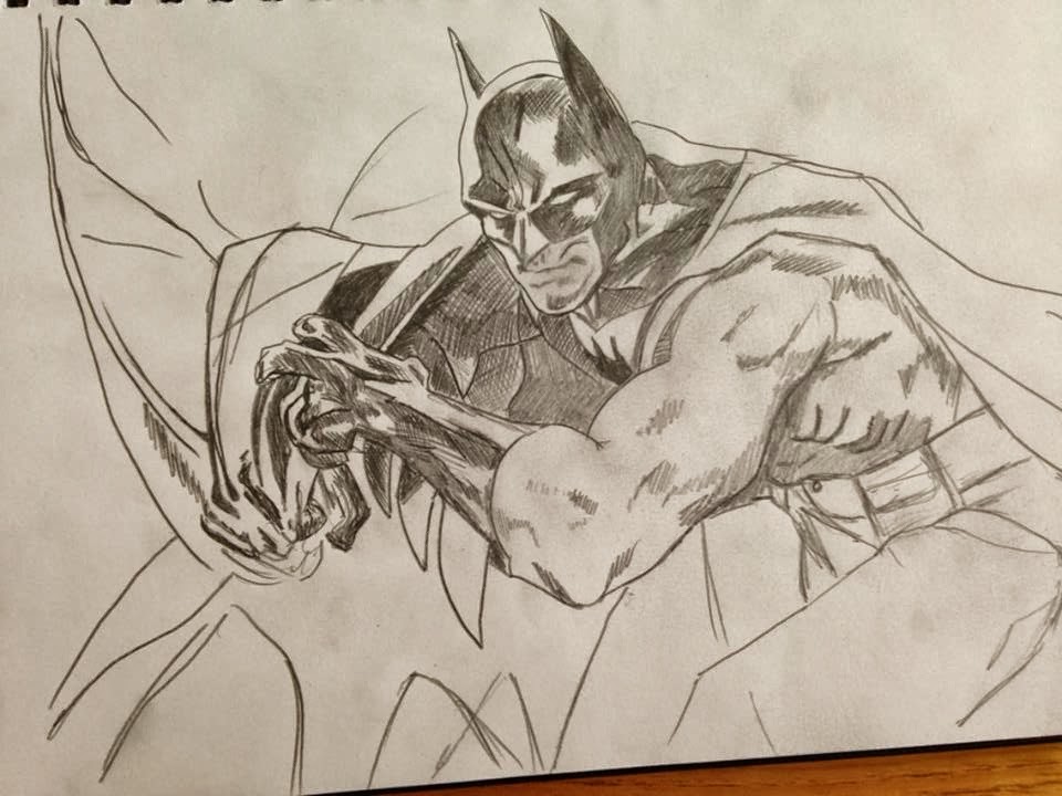
batman sketch

Wednesday, 30 October 2013

3D Model Room - Finished Renders

I'm in the finishing stages of my room now, I have textured most of my assets, I need to finish of the door and the top of the walls. I choose to use a cement texture for the door frame and the top of the wall with the grime effect. I think it worked really well with the rooms gloomy scene.(RIGHT) As you can see this is a non-rendered image and you can notice the different textures, cement and wall tiles, really well but once its rendered you cant notice it as much.(BELOW).
In this image i created a dusty atmosphere in my lighting to give it that extra old/gloomy effect, like its been abandoned for many years. 
This picture is one of my final renders. I placed 6 cameras within my room of my favourite angles to show of my work and get a good render.Below are my final renders of my finished Room.
Thank you for reading and showing interest in my first Game Art project.. I will be starting my next project next week which is modelling a Car then Transforming the car into a futurist Flying car so it will be fun. 


Wednesday, 16 October 2013

3D Model room - Textures

I finally finished all my modelling for my room and all the assets. There was a few I forgotten about like soap dispensers and toilets seats etc, just the smalls thing, but every assets counts.

So this is where the fun begins, well fun before I knew it was going to take 6 hours to texture my floor correctly!, but its so worth it. I started texturing the main big assets like the floor and the walls first. remember how I wanted my room to be old and dirty and falling apart,  well this is where all that comes in to play. First of all I went back into my research to find my chosen floor texture, then I applied it but it looked to clean so i had to do alot of changes on Photoshop like adding grime and dark effects and broken tiles. Below is my original chosen floor texture.

  And this is my floor texture now, as you can see its alot different to the original. on the left is a render image of the right image. Its very dark and dirty, exactly how I want it so I am really happy with it. worth the 6 hours it took. the reason its dark in the render is because I still have my lights in effect. 

After a I stopped admiring my floor texture I thought best to start on my walls. I wanted the same kinda of effect for my walls that I had on my floor, so broken tiles and grime all over.  Below is my original wall texture I choose. 
This is actually slightly darker than the original, I thought this was a good wall texture to use, so I got to work in Photoshop trying to make this texture like my walls and this is how it came out (BELOW)
Again I was very happy with the result, this is with the 'specular map' and the 'bump map', the specular map makes the textures shiny if they need to be and you can increase and decrease the shin as you please, the bump map AKA the normal map gives us the 3D effect, well makes it bumpy, to make it look more real and makes it look like its meant to be there. From this picture you can really see the bump map working as the angle is straight on and this isn't a rendered picture, but I assure its there. Also I know the skirting board is missing from this picture.

Having the biggest assets finished i moved onto the smaller but the important assets in the room which is the urinal/toilets and the sinks. the urinal was the most difficult out the three as I couldn't quite find a good grimy textures to show rust and piss stains but after a hour or so goggling piss and stains I found one. 
I combined this texture of water stains with a metal texture to produce a rusty/stained metal texture for the urinal. Then of course added a spec map and bump map. and this is the result (RIGHT)
This is with the texture applied to my urinal model. (BELOW)
Its all coming together now, works really well when you see the floor and walls textured together and the urinal texture worked really well too, I didn't have to do much adjusting which was good and saved alot of time. Making the texture for the sinks was pretty easy compared the previous assets. I already had the rust textures and all I needed was a plain white porcelain texture then layer on the rust, And same as the urinal the texture looked good without to many adjustments needed. I decided, as there are three sinks, to change the texture on one of them so they all didn't look exactly the same. all I had to do was move the rust layer on Photoshop and save it as a separate file then apply it the the other sink. I cloned the first sink as I done all the mapping for the texture to be applied so cloning the sink twice kept the mapping so there was no need to do that again which always saves alot of time. Straight after I finished the sink I quickly made the plugs which was simple then worked on the mirror. This again was alot easier than I thought it would have been.I made a grey plane on the wall where I want the mirror then found a broken mirror texture and applied it .Then created a spec and bump made and made the bumps very prominent to show of the cracks in the mirror. To make the mirror a mirror, to reflect of course, all I did was add a ray trace to the reflection map and adjusted how much it reflected. I toned this down alot as the mirror is old and smashed. (BELOW)
For the toilets I used the exact same texture as the sinks which worked, I still have a very long way to go yet but I am slowly getting there, there are still loads of small assets to finish of but shouldn't take to long and as always I will show you what I have achieved. 

Thank you for reading so far, loads more to come very soon. Don't forget to follow me !!!

Tuesday, 15 October 2013

3D Model Room part 2

Hi welcome back! Continuing from the last post I have made alot of progress, also playing around with texturing.I added industrial air ducts, drain and a door then I thought being a bathroom the main assets are going to be the toilets and the sinks so I made a start. Here is a basic model of a sink I made (BELOW).


I know its not very smooth at the moment but it will once i have textured it and then applied turbo smooth, ill even add a few chamfers to supports the edges. here's a quick look at it when its turbo smoothed(BELOW) .....


I think you would agree that its looking alot better now. Once I was happy to continue with the sinks i cloned this one twice and added the plumbing and the support stands. the plumbing took some time to get right but i think it came out pretty well.. What do you think?..


I left the middle turbo smoothed just to see how it looks in my room.
I want my room to be dark and unused so i started to play around with the lighting. i made 3 panel lights and imported a target spot light for 2 of them and adjusted the light shape and density of the light. i decided to have one of the lights broken and hanging of the wall. I also added an omni which gives a soft background light, i added this because even with the lights the room was way too dark to see any of my hard work. here's a top view with the lights on(BELOW)...


I think the lighting works really well here. Giving the room a nice gloomy effect, and can still see all my hard work :). Moving back to modelling assets I began working on my toilet. I had to go back to my references and find some more to work out what shapes to use and how I was going to achieve the whole toilet shape. I began with a sphere then sliced the top of to get the bowl shape. Then using the verts I created an egg shape. From here I extruded the top then modelled down around the sphere to create the toilet shape. Then I used a simple box shape to make the backbox of the toilet then made the seats. Below is my finished product without any turbo smooth as I still have to texture it.

Monday, 7 October 2013

3D model Room

My Model Room

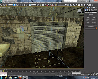
For my second project we had to design and build a 3D Room on 3Ds MAX. The style and theme of the room was our choice. I wanted a room where I can show off old, dark and grungy textures to give the room a story and a weary feeling. I wanted to create a room that no one else was doing, the first thing that came to me was the bathroom scene from the SAW film. So the Project was broken down into different stages, Stage one being the RESEARCH. 

 The Research

Research is very important when modelling a room, well its important when modelling anything. So I went straight onto GOOGLE images and downloaded loads of pictures of toilets, never thought I would be doing this is my life !!. I got loads of pictures from the bathroom scene from SAW(BELOW), I choose to base my whole room around this.

There are some really good textures to work on here!!, I also found pictures from the game SAW.
When your researching its good to get loads of different angles of the room/asset you are creating.


Once I had enough pictures I started to model my room using the simply box shape to create the walls(below)


First of all i create one side of the room, then extruded the wall around to make the room outline as you can see in the images.

I included the door at the rear of the room and added a floor, this gave me my basic model room. as you can see I created a drainage hole in the middle of the room using the plane which I used for the floor. (RIGHT)

Now its time to start thinking about all the assets that are going to be in my room. the obvious ones are of course the toilets and sinks but there are many more, alot more than I originally thought. as part of my research in public toilets I made a list of assets. then started modelling them one by one.

I started with the pipes, which were just simple cylinder shapes and adjusted to the diameter and length needed, i then extruded a section of the pipe to create the rings and detached them as separate objects so i can texture them and move them freely (BELOW).


  Using my references of my cubicles I created .. you guessed it.. Cubicles! The cubicles are made from simple box shapes.


So far I have my walls, floor,drain hole, pipes and the cubicles modelled.. looking so far right, still have so much to do but were getting somewhere. I can visualise the textures like the wall tiles all broken and the blocked drain, rusty pipes and grime on the floor. (Below).

My next asset I chose to do is the Urinal which proved move difficult than I thought but after hours of messing around with the box shape I like the final outcome (Below)

 Its still no where near finished... I'm texturing all my models towards the end, once the asset is textured I can chamfer edges to make them less ridged. I want you to see what I see when I look at this urinal. just imagine a metallic texture with grime and urine stains on the back and rusted metal on the edges. maybe ill make the drain blocked too, such a lovely image right.


Thank you for reading stay tuned because model room  Part 2 is coming soon :D


Wednesday, 2 October 2013

My First Blog

Hi and welcome to my first ever blog and my first post.
So first of all I'm going to start by telling you something little about me and my background. I'm 21 years old and from Yeovil somerset UK. I joined the Army when I was 16 years old, I have always been an artist at heart so after 5 long long long years in the Army I left to pursue a career as a Games Artist. why a games artist? well all my life I have loved drawing and designing comics and game characters, and when I wasn't drawing and attempting to have a social life I played games, alot alot of games and that hasn't changed. you could say I'm addicted but nah!! I'm just a gamer.
But before my dream job becomes a reality I have enrolled at St Helens college to get a (BA) Hons degree in Game Art to broaden my skills as an artist and learn new skills to help me achieve my goal. So over the next three years I will be uploading my hard work on this blog and every now and then upload some cool gaming news and nerdy stuff.
Week 1
In my first week, after all the meeting and greeting we learnt the basics of 3d modeling using 3DS MAX and Photoshop then we got to work on our first project. modeling a cardboard box. Sounds simply right? WRONG! well making the box shape was easy but then it gets complicated. Once you have the object we then have to texture the box shape to make it look like a real box as it is designed to be imported into a game. after applying all the different layers it started to look good.
This is my box ! looks pretty real right?, it almost fooled me, well it actually did fool many of my friends and family when I uploaded pictures onto Facebook, they were like ' Why are you uploading pictures of a random cardboard box' HA HA idiots!! then I decided to add flooring and lighting to make it look even more impressive!


And there it is ! oh did anyone notice my added batman sticker!

Once a week we have life drawing classes and game studies, this is when we improve our skills as an artist by going back to the old roots with no computers, just good old pencil and paper. Every week we use different art medium eg pencils and charcoal, with different objects and lighting. the first week was a few random objects and a manikin ( haven't got a real life model yet!). this is how it came out.


Obviously I didn't get to finish it but I was happy with it.


In the second week our next project was to model a whole room which is what I'm currently working on now so please stayed tuned for the next post coming soon about my model room. Pictures included!!

Thank you for reading my post.  
If you are interested in Game art and want help with anything on how to get into being a games artist I am happy to help, just send me a message or email and  will get back to you ASAP thank you.